The rapid rise of interest rates will have notable effects on our economy and markets for years to come, especially if these higher rates persist. It’s fascinating to see what it’s done to the housing market.
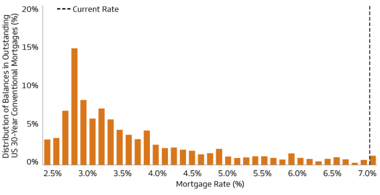
The below chart is the distribution of mortgage balances at various rates. It’s estimated that 98% of borrowers have a below-market mortgage rate. This disincentivizes refinancing activity or in many cases moving, as borrowers are reluctant to leave a below market rate, giving homeowners “golden handcuffs.”
Distribution of Mortgage Balances at Various Rates

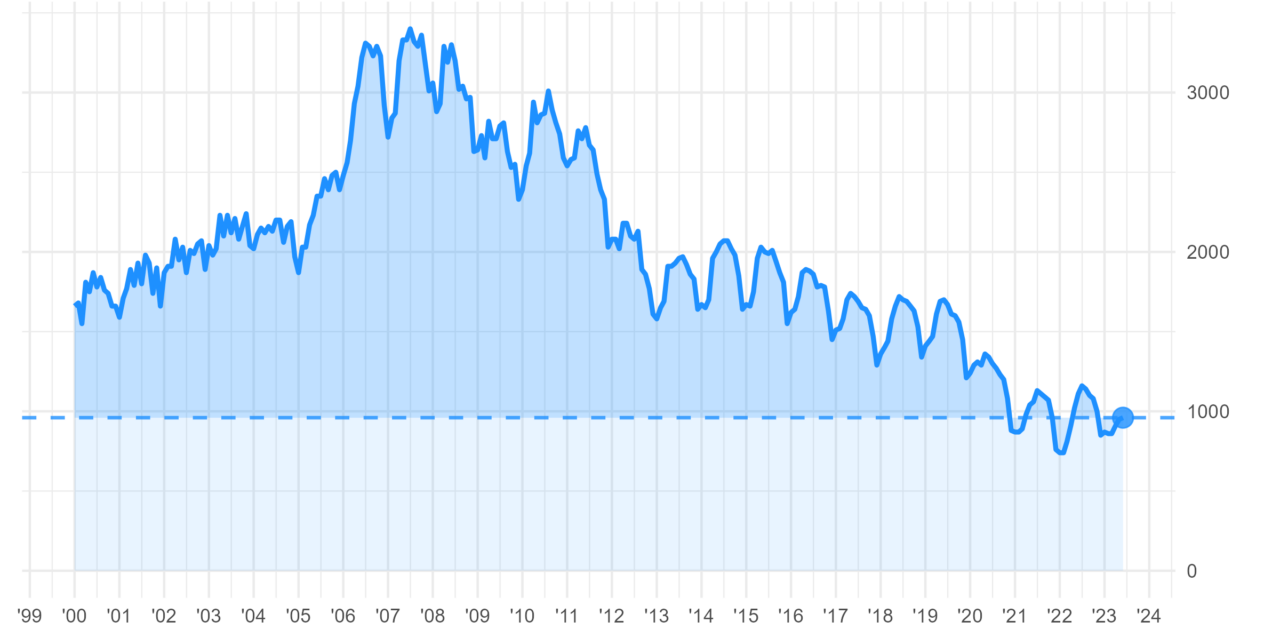
Even if prospective homebuyers wanted to buy, there isn’t much inventory out there, likely influenced by the conditions above. Below is a chart showing (existing) single family home inventory levels which are hovering around multi-decade lows.
Tight Home Sales Inventory
Number of US single-family homes available for sale (1,000s, NSA)

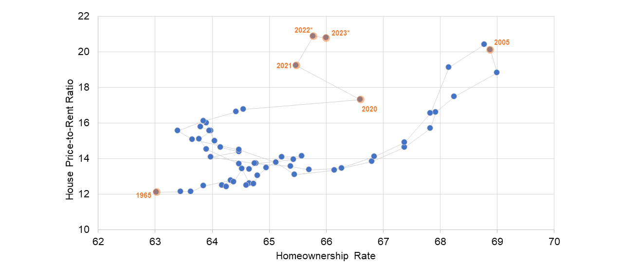
It’s not just the supply side of the equation that is hampering home sales…it costs a lot buy a house, especially compared to renting. The ratio of house prices to rents (below chart) has surpassed the early-2000s peak. i.e. much more financially appealing to rent than buy.
Homeownership Rate and House Price-to-Rent Ratio

Housing/shelter is a large share of CPI (inflation) and for most people, is their largest asset purchase within their life. When aggregated, there is a large amount of wealth in homes that is at times used to support consumer spending (67% of GDP). It’s hard to forecast a “breaking point” here for the housing market – demographics still support a long runway for new housing in this country. Certain markets might see (and are seeing) a correction in price, but it’s been mild at best. Should an investor be worried? Not nearly to the great financial crisis level. But something to keep aware of.


